Home Colors
What color is “graphite”? Graphite is a gray-black color with pearlescent highlights. It acquired its name after the mineral. To more accurately understand what graphite looks like, you can look at the lead of a simple pencil.
For greater clarity, shade a section of white paper tightly and you will get a true graphite shade. It is cold, very dark, almost black, but muted, with a metallic sheen.
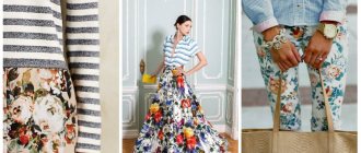
Graphite color clothes
The color graphite is popular in the manufacture of fur and suede clothing. Graphite-colored fur coats look more stylish compared to brown and black ones. Such products are universal, much more practical than fur coats in gray shades.
Graphite is ideal for selecting clothes in a business style, no matter whether it is individual wardrobe items or entire sets. Today it is very fashionable to add lurex threads to graphite-colored clothes to give the fabric a metallic shine. It looks quite expensive.
The graphite color will suit blondes with fair skin, who are “Summer” in color type. The color will look good on brunettes with fair skin and light eyes.
Combinations of clothes with graphite color
In clothing and accessories, a rich shade of graphite can be perfectly combined with white, pale pink (this is one of the most winning combinations), beige, pale yellow, blue, turquoise, pink, light green, red (and its shades), with purple (and its shades). shades). It's surprising that this obviously “cool” tone can go well with warm orange and coral.
Graphite is one of the favorite shades of Italian fashion designer Giorgio Armani. It looks harmonious in sports, casual and rock clothing sets.
A dark, deep shade of “graphite” color, which is closer to black in the color chart, is successfully combined with turquoise, red, pink, lilac, coral, rich blue and violet.
Lighter, gray “graphite” is combined with light yellow, dusty pink, lavender, blue, rose-red and light green. It is worth combining clothes with such combinations. It is also useful to remember that there are shades that can be combined with anything, such as white, black, and all shades of gray.
Hair color "graphite"
Today, Graphite hair color is very popular. You can dye your entire hair or individual strands with it. The coloring pigment is based on a gray color with a slight shine, that is, with a mother-of-pearl effect.
Many girls are afraid of this shade of hair, because it resembles the color of gray hair and visually adds age. However, this is a misconception. Graphite-colored hair is a couple of shades darker than gray, more saturated. The color is rich in halftones and shimmers beautifully in the sun.
It is important that the graphite color matches your color type, then the overall image will look more interesting and mysterious. Graphite is suitable for people with cool gray (various shades), blue, turquoise eyes.
- Hair color Graphite: fashionable shades, who suits it
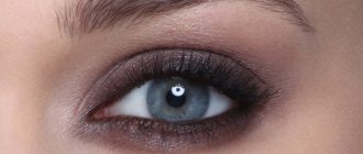
The color graphite has been popular in makeup for a long time. It is universal and suits almost any eye color.
Graphite color in the interior
Such a stylish color as graphite is very often used in interiors today, as it is universal, unobtrusive and easily combined with other shades. Popular designers love to decorate houses and apartments with them. Its most fashionable combinations are with white, pearl, and ivory. It also goes well with mustard, beige, red and sky.
The color of graphite has several shades from dark gray to light gray. In the names of paints and products, the most common designations are “black graphite”, “light graphite”, “matte graphite”, “blue graphite”.
The perfect combination of red and white ↑
This is the brightest option and will be relevant at all times. White color goes well with any shade of red, so feel free to experiment. You can make red the main color in the image, so to speak, the center of the exposure. Or you can use red as an accent in accessories or individual items of clothing. (see photo) In any case, red and white clothes refresh and clean for several years. Even the traditional wedding dress is moving away, giving way to interesting combinations.
By the way, a white dress with red polka dots or vice versa looks very beautiful. I just recently wrote an article about a polka dot dress , be sure to read it.
Color combination rules

What colors does olive color go with to make everything look neat? To do this, you should follow simple rules:
- a combination that contains two to four colors will be successful: more of them will not look very neat, and plain clothes will look boring;
- the color scheme of the image must be chosen in different proportions: one color is the main color, another emphasizes, and the third emphasizes some details;
- black and white colors are universal, so bright colors, for example, yellow, blue, red, go well with them;
- The combination of related tones looks harmonious, which makes the image elegant, but contrasting shades look no less beautiful;
- The figure will look slender if the bottom is darker than the top.
Green tones look very original. Among the shades there will surely be a suitable color that will become an important part of the image. Such clothes will be indispensable for different occasions.
The best combination of gray and red ↑
If you think that red is too provocative for you, but you want to try to feel yourself in this color, then you can combine red with gray. This combination is not perceived as brightly as with white and creates a delicate image. Look at the photo below and you will find the look that suits you. Gray color can also be called universal and is compatible with almost any other color.
Also with this article read “What clothes to wear with red sandals: photo images” . Here you will see many photos with interesting solutions and looks.
Combination of red and black ↑
The combination of red and black can also be considered an absolute classic. This option is very suitable for a dinner party or party. Arriving in such an outfit, you will look luxurious, rich and tasteful.
You will be interested in a new article on the blog: What to wear at home? Clothing for a housewife and a young mother . What clothes can you wear at home and please your husband? The answer is in the article.
Recommendations for selection
By wearing such outfits, you don’t have to worry about getting lost in the crowd. Berry and fruit shades will invariably attract attention. However, with the right wardrobe, you will never look pretentious and vulgar.
Raspberry, lingonberry, plum, peach and other colors of the orchard can be used with equal success both in clothes for everyday life and in formal dresses for an evening out. So, wine and plum color in combination with silk, brocade or satin will look simply royal. This is true for going to the theater, opera, and dinner parties. At the same time, a soft apricot high-waisted dress made of light chiffon is perfect for more informal events.
When putting together an office wardrobe, you should be more careful - brightness is not always well received by a strict dress code, and it simply distracts the attention of others, preventing them from concentrating on work matters. Therefore, in this case it is better to give preference to deep, dark berry colors.
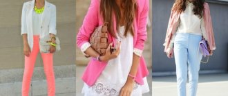
Red and beige colors in clothes ↑
Red color combines very softly with various shades of beige: cream, sand, creamy, yellow-peach. Look at the photo below how beautiful the combination of burgundy shades of red with beige is.
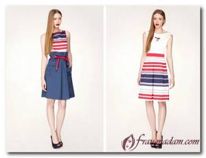
Red combined with stripes and checks ↑
It is allowed to wear red with various stripes. It can be black and white, hay and white or red and white stripes. This choice gives the image a youthful style and the lightness characteristic of young people. The red checkered pattern has also not lost its relevance for several decades.
If you are not a fan of women’s blouses, then we recommend reading the article “Red checkered shirts and creating stylish looks . In it you will find information on how to create a fashionable look with a regular checkered shirt.
Looking for an unusual wedding dress? Then you need to read the article “Wedding dress with red elements (photo)”
Combination of red, blue, cyan and turquoise colors ↑
In this look, denim plays the role of some background, and red sets accents and attracts attention. This also includes a combination with a bright blue color, which is also called cobalt. But some shades of red go perfectly with dark shades of blue, up to the shade NAVY. The combination of turquoise and red looks interesting, just don’t go wrong with a shade of red.
Fruit and berry emotions: the main thing is not to overdo it
By the colors used in clothes, a lot can be said about the person himself, his character, temperament, and tastes.
Knowing this feature, every fashionista can learn how to create the wardrobe she “needs,” which will help make the necessary impression on the people around her. Playfulness, romance, seriousness, passion - what is hidden behind the berry flowers in the clothes of the fair sex? Despite the fact that the same colors can be associated with completely different emotions by different people, there are a number of common features in the visual perception of shades. Thus, most colorists attribute to the berry palette such properties as energy, dynamism, festivity, and romance to one degree or another. Orange, lemon and raspberry are immediately personified with youth, activity, and fun.
At the same time, their excess in the wardrobe can lead to a completely opposite effect. The bright abundance of those around you will be annoying, or even irritating. So, if you decide to wear an orange or yellow coat, be very careful and careful when choosing other items and accessories.
At the same time, berry shades such as wine, plum, and cherry look quite gloomy and depressing if you do not dilute the image with something bright or light. Apricot and peach colors look more democratic and self-sufficient. On the one hand, they lack the intensity of orange, and on the other hand, they easily perceive the proximity of white, black and many other shades. This allows you to create both pure and innocent images, as well as eccentric and unexpected ones.
How to combine pink and red in clothes ↑
Another combination that was recently considered incompatible. Today, such an outfit is quite relevant and at the peak of popularity. Pink and red come from the same color and can be said to complement each other, making the image romantic. Try to combine warm and cool shades of red and pink separately. Otherwise, the outfit will look vulgar.
Characteristics of fruit and berry flowers
Crimson
It personifies royal calm, which will be useful to you both on weekdays and on holidays. The color looks great in the design of different materials. This could be a cotton blouse, a wool sweater, or bright jeans. It is best to choose clothes in this spirit for representatives of winter and summer color types of appearance.
Orange
Represents the sun, fire, vitality and good mood, which will be very difficult for others to spoil. For some time now, the shade has been associated with revolution, but in this case we are talking about the character of the owner of the wardrobe as an independent girl, free from prejudices and stereotypes, with unconventional thinking. According to psychologists, this color is simply necessary for residents of the metropolis to maintain their physical and emotional health.
Lingonberry
A very practical color and a useful acquisition for a woman’s wardrobe, which will make the figure visually slimmer and more elegant. The shade is cool and not loud, so it is perfect for creating an office ensemble. Lingonberries are also associated with the holiday, so they are often used to create New Year's dresses. This berry shade goes well with warm materials - angora, wool, corduroy, mohair.
Plum
A color that creates a feeling of mystery, which immediately enhances the visual appeal of the owner of berry clothing. Ideal for all color types of appearance, except spring. For daytime business events, clothes of this shade will not be the most successful choice, while it is widely used when sewing spectacular evening dresses.
Cherry
The color will successfully dilute the gray boredom of an office wardrobe, introducing a rich touch of summer into it, which will allow you to achieve a more lively and vibrant image. You can also wear cherry outfits with pleasure on vacation, parties, romantic dates, where it will be an excellent alternative to the black classics, but at the same time it will be just as slimming as the silhouette. Interesting combinations can be made by using a berry shade and pink, gray, white colors, as well as combining it with denim clothing.
The combination of red and green in women's clothing ↑
It would seem that the combination of red and green is completely incompatible, because these colors create a very strong contrast. But it turns out that you can create very interesting sets, just choose the right shades of these colors. After all, in nature we very often see such a combination and why not embody it in our clothes.
If you use a combination of warm shades, then it is more suitable for children, teenagers and young adults. For older women, a combination of noble, cool shades is more suitable, which will make the image rich and respectable. Look at the photo to see how these two colors can be combined.
Using olive color in various rooms
In most rooms, properly chosen duets of olive color with light or bright shades will be a win-win option. Any combination will be especially relevant if there is an abundance of natural light in the room.
Kitchen
Olive in the kitchen is a very popular solution.
This color is non-staining and pleasing to the eye. A tandem of olive with various wood tones is often used: the most fashionable is an interior in which up to 50% or more natural wood tones are used. In a small room, it is better to pay attention to light shades. A good example is the kitchen, where the walls are olive-colored and the furniture is wood-beige. You can liven up the room with orange or fuchsia accents.
Living room
For a living room in a classic style, olive is ideal, especially in its most muted colors. Bright finishes and pretentious contrasts are not used: there should be no flashy solutions here. If the room seems gloomy, add patterns, caramel or beige-colored ornaments, and white accessories. For furniture: armchairs, sofas, light colors will also be the best option. In any case, the color of the furniture should not match the shade of the walls, otherwise the room will be dull.
The nobility of olive is emphasized by straight, strict lines, three-dimensional patterns and the following shades in the decor:
- chocolate;
- wheat;
- light brown;
- wenge.
Bedroom
In this room it is better to avoid too bright, exciting colors, because it is intended for rest and relaxation. Therefore, a light olive color scheme is used for walls or textiles, which can be complemented with inserts of milky, caramel, and mustard shades. The decor of light terracotta, brick, or brown colors in small quantities (for example, vases, photo frames, floor lamps, lamps, rugs) will look beautiful.
Bathroom
For the bathroom, the use of olive tones is rare. Designers avoid this color in the bathroom, considering it too dull and gloomy. But with proper organization of lighting, the problem will disappear by itself. It is also important to avoid combinations that are too contrasting: they can visually reduce the volume of the room.
A bright bathroom in which the decor or plumbing is in olive color looks very interesting.
Children's
Usually the dark color of olive is considered “adult”, because it does not evoke associations with fun and childish spontaneity. Due to its solidity and nobility, this shade is practically not used in children's rooms. However, for teenagers and overly restless children, olive will come in handy. You don’t need to paint the walls with it; just introduce it into the interior as accessories or as an accent.
Hallway
In the hallway, olive is not only appropriate, but is considered one of the most desirable colors. A popular design technique is to decorate walls in olive color using Venetian plaster or artificial stone. On the floor, you can also install tiles in a dark olive color scheme, because this color is very practical and hides dirt well. It is only important to provide a sufficient amount of light in the hallway, which will eliminate excessive seriousness and gloominess of the finish.
Red, purple and lilac in clothing combinations ↑
I must say that all these colors are friendly and are located next to each other, so their combination will look beautiful. Purple is formed by combining red and blue in different proportions.
You bought an elegant red dress, but you don’t know what tights to wear it with. Then the article “How to choose the right tights and stockings for a red dress?” very useful for you.